How to Fix Cumulative Layout Shift (CLS) on WordPress
Content jumps as the page loads and Search Console reports a CLS issue. Find the element that moves and why, then reserve space for images, embeds, ads, fonts and banners.
You start reading a page and the text jumps down. You go to tap a button and an image loads above it, so you tap an advert instead. Search Console’s Core Web Vitals report says “CLS issue: more than 0.1 (mobile)”, and PageSpeed Insights shows Cumulative Layout Shift in orange or red. The page may load quickly, but it does not hold still.
This guide shows how to find exactly which element moves and why, and how to fix the usual causes on WordPress: images without dimensions, embeds, ads, cookie banners, fonts, sticky headers and builder animations. It is for site owners and the designers or developers who build their pages. Loading speed is covered in fixing LCP and responsiveness in poor INP.
What is happening
A layout shift happens when something already visible on the screen changes position because something else appeared, grew or shrank without warning. Each shift gets a score based on how much of the viewport moved and how far. Shifts that happen close together are grouped into bursts (session windows of up to five seconds, with less than a second between shifts), and CLS is the score of the worst burst during the whole time the page is open, not just during loading.
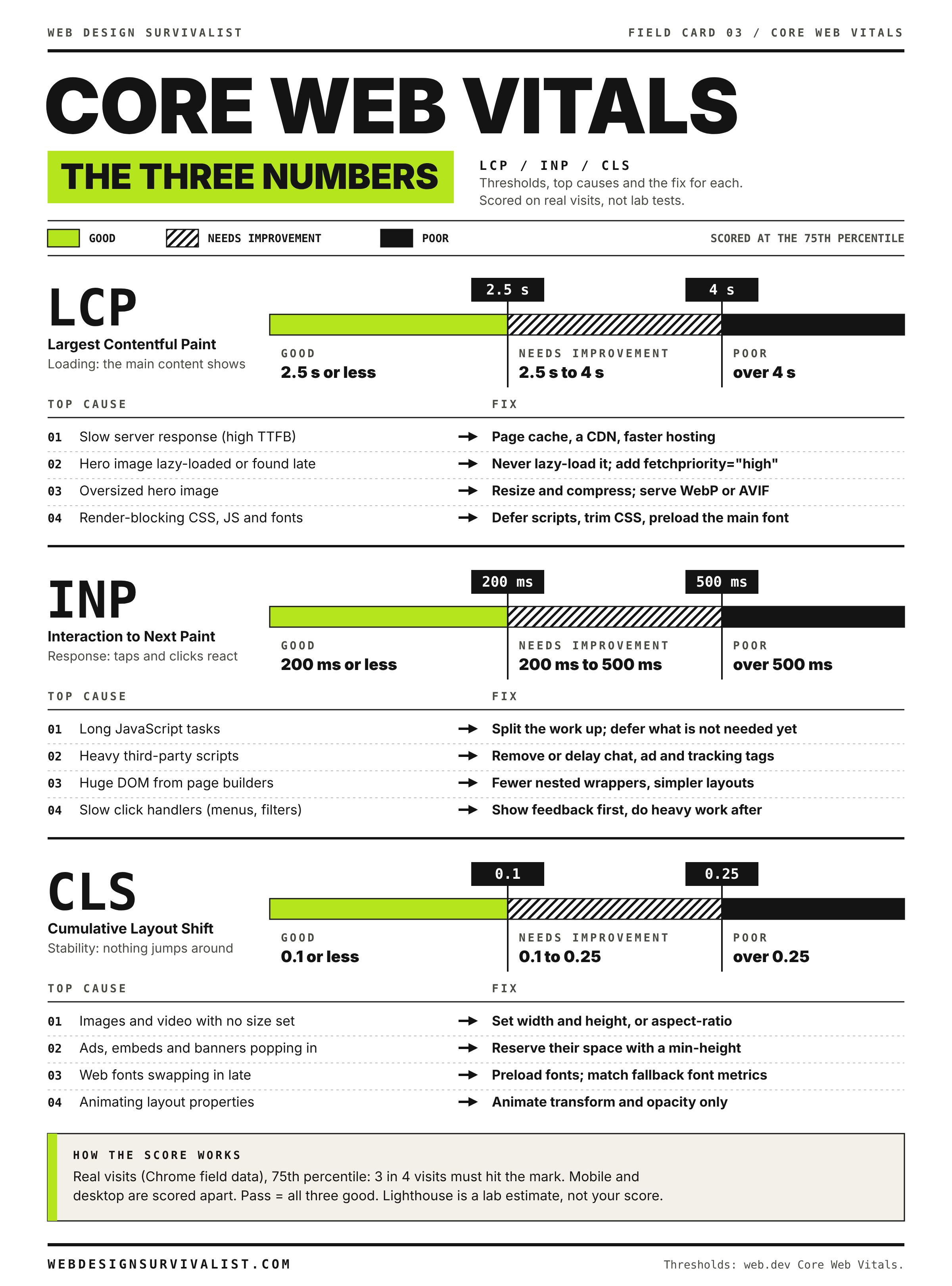
web.dev’s thresholds, at the 75th percentile of page loads on mobile and desktop separately:
CLS
Rating
0.1 or less
Good
Over 0.1 and up to 0.25
Needs improvement
Over 0.25
Poor
CLS has no unit; it is a score, not seconds. Two things do not count against you: shifts within half a second of a visitor’s tap, click or key press (so an accordion opening when clicked is fine), and new content added in a way that does not move anything already on screen.
web.dev lists the common causes as images and videos with no dimensions, fonts that render larger or smaller than their fallback, and ads or widgets that resize themselves. On WordPress you can add cookie banners, notification bars, sticky headers that change height, sliders that set their size with JavaScript, and builder entrance animations.
Why you do not see it yourself
On your own computer the images and fonts are usually already cached and the network is fast, so things arrive before the first paint and nothing visibly moves. A first-time visitor on a phone gets them later, after the text has been drawn. web.dev specifically warns that shifts often look better in development than in production for this reason. Always test in a private window with throttling.
Like LCP, Search Console uses field data from real Chrome users over a rolling 28 days, so fixes take weeks to show there. And because CLS counts the whole page lifetime, a shift caused by lazy-loaded content as the visitor scrolls, or by an infinite scroll feed, can fail a page that looks stable at load.
Before you start
Access: WordPress administrator, your page builder, theme settings and any optimization plugin.
Browser: desktop Chrome or another Chromium browser for DevTools.
A baseline: save PageSpeed Insights results for each problem template before changes.
Staging if available. Most fixes are CSS or settings, but test them on a copy first when you can.
Step 1: Find the pages and the moving element
In Search Console, open Experience > Core Web Vitals, choose Mobile and click the CLS issue to see the URL groups and example URLs. Groups usually map to templates.
Run one example per group through PageSpeed Insights, Mobile tab.
In the diagnostics, find Avoid large layout shifts or the Layout shift culprits insight. It lists the elements that moved and, where it can tell, the likely cause, such as an unsized image or a web font.
Lab tools only see shifts during the test load. If PageSpeed Insights lab CLS is near zero but field data fails, the shifts happen later: when the visitor scrolls, after a cookie banner appears, or when an ad loads. That points to Step 3 and Step 4.
Step 2: Watch the shifts in Chrome DevTools
Layout Shift Regions
Open the page in a private window and open DevTools.
Press Ctrl+Shift+P (Cmd+Shift+P on a Mac), type Show Rendering and press Enter.
Check Layout Shift Regions.
In the Network tab, set throttling to a slower profile such as Slow 4G, then reload.
Areas that shift flash blue. Watch the top of the page as it loads and as you scroll. The area that flashes is what moved; the cause is usually just above it, where something appeared or grew.
Performance panel
For exact figures, open the Performance panel, apply CPU and network throttling, and click Record and reload. The live metrics view shows CLS for your visit. In the recording, the Layout shifts track marks each shift; click one to see the score and the elements that moved. The Layout shift culprits insight in the sidebar groups the worst cluster and names likely causes, such as unsized images, web fonts or injected iframes.
Log every shift in the Console
This snippet, pasted into the DevTools Console before you reload with Preserve log checked or after the page has loaded, prints each shift’s score and the elements that moved. It uses the browser’s standard Layout Instability API and changes nothing on your site.
new PerformanceObserver((list) => {
  for (const entry of list.getEntries()) {
    if (!entry.hadRecentInput) {
      console.log(entry.value.toFixed(4), entry.sources.map((s) => s.node));
    }
  }
}).observe({ type: "layout-shift", buffered: true });
buffered: true includes shifts that already happened before you pasted it. hadRecentInput skips shifts caused by your own clicks, as CLS does. Click a logged element to jump to it in the Elements panel. Scroll down the page slowly to catch shifts from lazy-loaded content.
Step 3: Fix the common causes
Images without dimensions
If an <img> has no width and height attributes and no CSS aspect ratio, the browser does not know how much room to leave until the file downloads, so the content below jumps. Lighthouse reports this as “Image elements do not have explicit width and height”. WordPress adds dimensions to images inserted from the Media Library, but you will often find unsized images in:
logos in the header, especially SVG logos uploaded through a theme or builder setting;
builder image widgets set to a custom or percentage size;
images in custom HTML blocks or widgets;
images swapped in by lazy-load scripts that use a tiny placeholder of the wrong shape.
Add the image’s real pixel width and height as attributes. Modern browsers use them to work out the aspect ratio even when CSS makes the image responsive:
Your theme stylesheet normally adds max-width: 100% and height: auto so the image still scales on small screens. For background images and containers, use the CSS aspect-ratio property, for example aspect-ratio: 16 / 9;, so the box has the right height before anything loads.
Embeds and iframes
YouTube, Vimeo, maps, booking widgets and social embeds often arrive as an iframe that starts at zero height or a default size and then resizes. Wrap them in a container with a fixed aspect ratio or minimum height. WordPress’s embed blocks have an option to resize for smaller devices that keeps the ratio; check it is on. Third-party review or booking widgets that grow when their script loads need a min-height on their container matching their usual height.
Ads
Ad slots that start empty and expand when an ad arrives are a classic cause. Reserve space: give each slot a min-height equal to the most common ad size served there, and avoid placing ads at the very top of the content where every shift moves the whole page. Automatic ad placement features that insert ads anywhere they choose are hard to stabilize; consider fixed placements. If an ad sometimes does not fill, a reserved empty space is better than a collapsing one.
Cookie banners and notification bars
A banner inserted at the top of the page, above your header, pushes everything down when it appears. Choose an overlay layout (fixed at the bottom or as a floating box) that sits on top of the page instead of in the normal flow. The same applies to “free shipping” bars, announcement bars and chat widgets. If a bar must sit in the flow, render it in the HTML from the start rather than inserting it with JavaScript. See cookie banner problems.
Web fonts
Text is first drawn in a fallback font, then redrawn in your web font. If the two fonts have different widths or line heights, lines rewrap and everything below moves. Options, from simplest:
Use fewer fonts and weights, self-host them, and preload the one or two files used above the fold.
Use font-display: optional for body text: the web font is used only if it arrives very quickly, otherwise the fallback stays for that page view, so there is no swap shift.
Pick a fallback font with similar proportions and fine-tune it with the CSS size-adjust, ascent-override and descent-override descriptors in an @font-face rule for the fallback. Some font and optimization plugins can generate these.
A header that becomes sticky by switching from normal position to fixed position removes itself from the flow, so the content jumps up by the header’s height. A header that shrinks on scroll can do the same. Use position: sticky, which keeps the space, or reserve the header’s height with padding on the page when it turns fixed. Shrinking with transform: scale() does not move other content.
Sliders and carousels
Slider scripts often show all slides stacked, or at zero height, until JavaScript runs and sets the size. Give the slider container a fixed aspect ratio or minimum height in CSS, so it occupies the right space from the first paint. Better still, replace a hero slider with a single image, which also helps LCP.
Entrance animations
Animations that move elements by changing top, margin, height or similar properties shift the layout. Animations built with transform and opacity do not count as layout shifts. Most builder entrance animations use transforms, but sections that collapse or expand, “read more” boxes that open automatically, and counters that change width can all shift. Remove animations from the first screen, which helps LCP too.
Late CSS from optimization plugins
If an optimization plugin’s critical CSS or “remove unused CSS” feature is misconfigured, the page first renders partly unstyled and then snaps into place when the full stylesheet loads. That is a large shift. If the page briefly looks broken on first load in a private window, regenerate critical CSS, or turn the feature off to compare. Settings that delay CSS or JavaScript are discussed in broken after Delay JS.
Content injected after load
Related posts, reviews, “recently viewed” boxes, WooCommerce cart fragments and personalization scripts sometimes insert content above existing content after the page has rendered. Reserve space for them or move them below the fold. In WooCommerce, mini-cart widgets that change size when the cart count loads are a frequent small shift in the header.
Back/forward cache
Pages restored instantly from the browser’s back/forward cache do not shift at all. Unload event handlers and some Cache-Control: no-store headers stop pages being eligible. Chrome DevTools has a Back/forward cache test under Application that reports why a page is not eligible.
Step 5: Validate and wait
Re-test each template in PageSpeed Insights and in DevTools with Layout Shift Regions on, including a slow scroll to the bottom of the page.
Purge every cache layer.
In Search Console, open the CLS issue and click Validate fix. Validation runs over a 28-day monitoring period.
Check field data in PageSpeed Insights over the next weeks as old visits leave the 28-day window.
If field CLS stays high while lab tests are clean, look for shifts that happen after load: consent banners on first visit, ads, scroll-triggered content, or shifts only on specific phone widths. Testing at a few common phone widths in DevTools device mode often reveals a breakpoint where a header or grid reflows. Layout problems at particular widths are covered in broken mobile layout.
Field card 03: Core Web Vitals: the three numbers. Print it on any black and white printer. All field cards
When to ask for help
CLS is nearly always fixed in the theme, builder, plugins or third-party scripts, not on the server. Send your developer or builder support:
the URLs and the CLS figures from PageSpeed Insights (field and lab);
a screenshot of the Layout shift culprits insight, or the Console output from the snippet above, showing the elements that moved;
a short screen recording of the page loading with Layout Shift Regions on;
a list of what is loaded above the fold: header, banner, slider, ads, embeds, fonts.
Search Console or PageSpeed Insights says your LCP is too slow. Find the LCP element, see which of its four parts is slow, and fix the hero image, server time or render blocking.
Search Console shows INP in red and buttons feel sticky. Learn what INP measures, find the long tasks behind it in Chrome devtools, and fix the scripts causing them.
Many slow sites are slow by design. Find the LCP element in PageSpeed Insights, then fix the hero image, trim font files, tame sliders and animations, and stop layout shift.